File:FINAL INFOGRAPHIC.svg
| Uploaded by | TommasoPrinetti |
|---|---|
| Upload date | 2023-10-04T13:58:03Z |
| MIME type | image/svg+xml |
| Dimensions | 512 × 309 px |
| File size | 862.6 KB |
Summary
| Description |
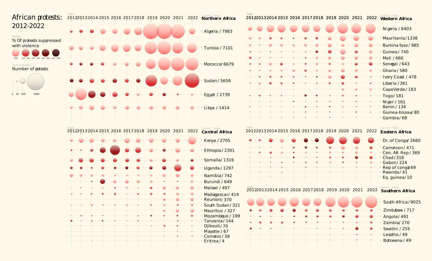
English: The infographic aims to emphasize the persistence and density of protests in the African continent from 2012 to 2022. It utilizes two visual representations: the size of bubbles represents the amount of protests, while the opacity of individual bubbles indicates the percentage of violent suppression. To interpret the graph, read it vertically to analyze data for specific years and horizontally to examine data for individual countries. |
| Date | |
| Source | Own work |
| Author | TommasoPrinetti |
Licensing
I, the copyright holder of this work, hereby publish it under the following license:


This file is licensed under the Creative Commons Attribution 4.0 International license.
- You are free:
- to share – to copy, distribute and transmit the work
- to remix – to adapt the work
- Under the following conditions:
- attribution – You must give appropriate credit, provide a link to the license, and indicate if changes were made. You may do so in any reasonable manner, but not in any way that suggests the licensor endorses you or your use.