File:NumPeopleByIncome2018.png
| Uploaded by | Pakwesi |
|---|---|
| Upload date | 2019-05-08T20:50:34Z |
| MIME type | image/png |
| Dimensions | 1578 × 814 px |
| File size | 105.8 KB |
Summary
| Description |
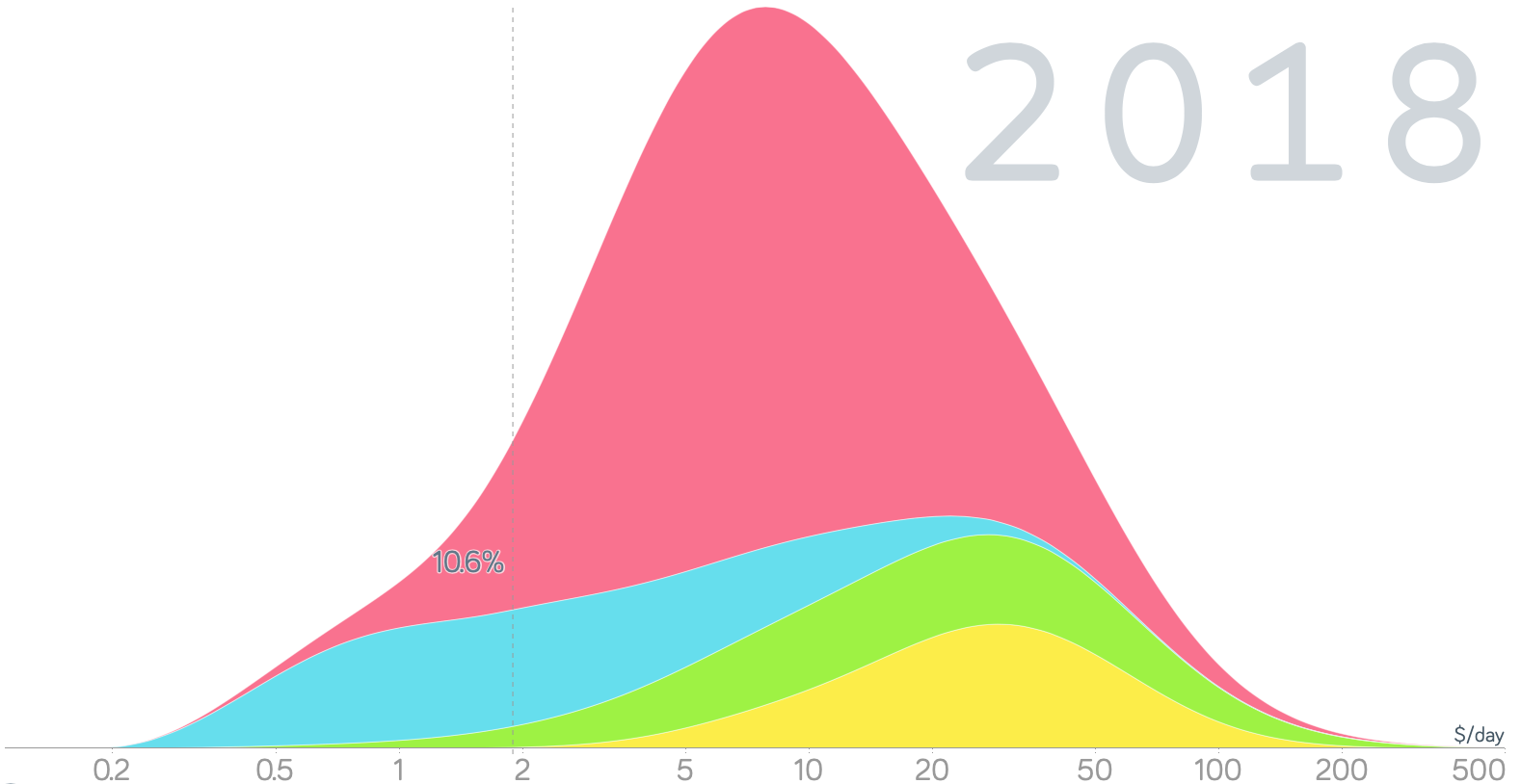
Deutsch: Das Diagramm zeigt für das Jahr 2018 die Anzahl Personen mit dem auf der horizontalen Achse aufgetragenen, täglichen Einkommen. Zur Vergleichbarkeit wurden die Beträge in die Kaufkraft des U.S. Dollars im Jahr 2011 in den USA umgerechnet. Die gestrichelte senkrechte Linie markiert die Definition der Weltbank für extreme Armut mit weniger als 1,90 $ pro Tag.
English: For the year 2018, the chart below shows the distribution of annual income among all world citizens. To make incomes comparable across countries and time, daily incomes are measured in constant 2011 International Dollars—this is a currency that would buy a comparable amount of goods and services that a U.S. dollar would buy in the United States in 2011. The vertically dashed line marks the World Bank’s definition of extreme poverty of less than 1.90 $ a day. |
| Date | |
| Source | https://www.gapminder.org/tools/#$chart-type=mountain |
| Author | Gapminder |
Licensing


This file is licensed under the Creative Commons Attribution 4.0 International license.
- You are free:
- to share – to copy, distribute and transmit the work
- to remix – to adapt the work
- Under the following conditions:
- attribution – You must give appropriate credit, provide a link to the license, and indicate if changes were made. You may do so in any reasonable manner, but not in any way that suggests the licensor endorses you or your use.